Prepare for IELTS with Shahida Noreen. Get Band 7+ Writing, Speaking, Reading and Listening strategies, AI-powered study tools, model answers, and daily practice lessons.
How IELTS Band is Calculated: The Ultimate Guide and Score Calculator How IELTS Band is Calculated: The Ultimate Guide and Score Calculator Updated for Peak Performance | Expert Analysis If you are planning to immigrate, study overseas, or gain professional licensure abroad, you already know that the International English Language Testing System (IELTS) is your primary gateway. To unlock competitive universities or preferred visa streams, a Band 7 or higher is almost universally required. However, when candidates sit down to take their diagnostic practice exams, they almost always fall victim to a classic, dangerous misconception: "If I get 70% of the questions correct, I will secure a Band 7." Shock Fact Band 7 is NOT 70%. The IELTS grading mechanism does not look at simple percentages. It operates on a precise mathematical framework that converts lo...
Writing Task 1 feels difficult at first — but with the correct structure and daily practice you can reach Band 7 quickly. This complete guide includes:
Band 7 model answer
Proven 4-paragraph structure
Essential vocabulary with examples
Many real IELTS chart examples (bar, line, pie, table, process, map)
Practice exercises
Interactive quiz
Common mistake fixes
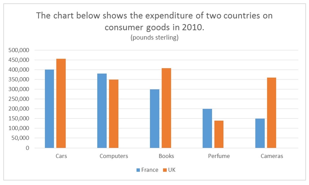
Typical IELTS bar chart – consumer goods spending
What Examiners Want in Task 1 (Academic)
Band 7+ requires good Task Achievement, Coherence & Cohesion, Lexical Resource and Grammatical Range & Accuracy. Beginners improve fastest by mastering one reliable 4-paragraph structure that works for almost every visual.
⭐ Most important rule: You MUST write a clear overview paragraph (usually paragraph 2). No overview = maximum Band 5 — even if everything else is excellent.
The Perfect 4-Paragraph Structure
Introduction → Overview → Details 1 → Details 2
Sample Question: Bar Chart – Renewable Energy
The chart below shows the percentage of energy generated from renewable sources in four countries from 2010 to 2020.
Band 7 sample bar chart – renewable energy by country
Band 7 Sample Essay (Renewable Energy 2010–2020)
✨ Model Answer – Band 7 Level
The bar chart compares the proportion of energy derived from renewable sources in four European nations (Germany, France, the United Kingdom, and Sweden) over a decade from 2010 to 2020.
Overall, Sweden was by far the largest user of renewable energy throughout the period, while the UK consistently generated the smallest share. All four countries showed an upward trend, with the most significant increase recorded in Germany.
In 2010, Sweden produced almost 50% of its energy from renewables, far ahead of France and Germany (approximately 15% and 18% respectively). The UK lagged considerably behind at just 7%. By 2015, Sweden had risen to 55%, while Germany overtook France with roughly 25% compared to 22%. The UK saw only modest growth to 12%.
During the final five years, Sweden peaked at 62% in 2020 and maintained its leading position. Germany continued its strong growth, reaching 38%, whereas France stabilised at around 28%. The UK showed steady but limited progress, ending at 18% — remaining the lowest but demonstrating gradual improvement.
More Visual Examples – All Main IELTS Task 1 Types
Seeing different visuals helps you spot trends faster. Here are real IELTS-style examples:
Line Graphs
Line graph – hospital admissions in five hospitals
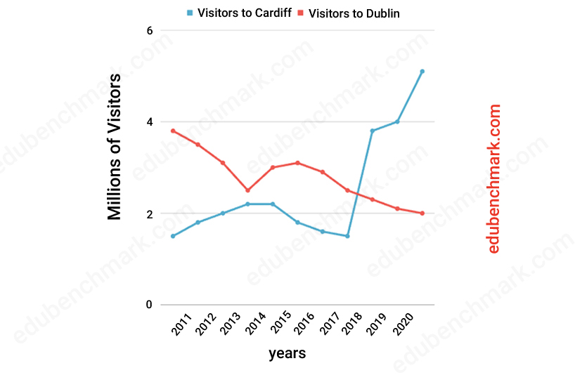
Line graph – visitors to two cities over time
Pie Charts
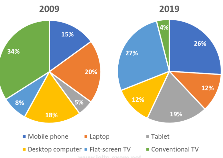
Paired pie charts – electronics sales (two years)
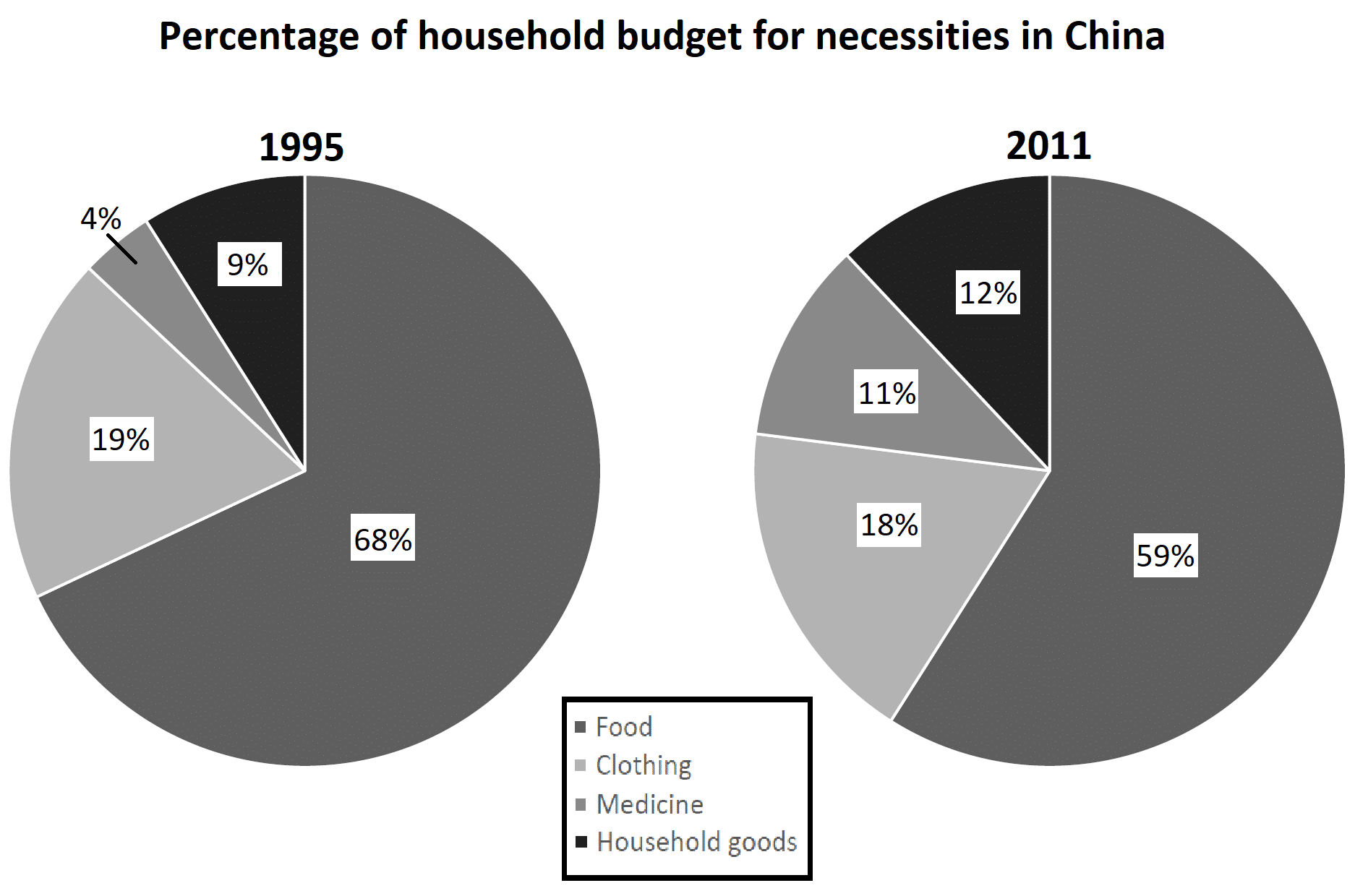
Paired pie charts – household spending changes
Tables
Table – underground railway systems in six cities
Process Diagrams
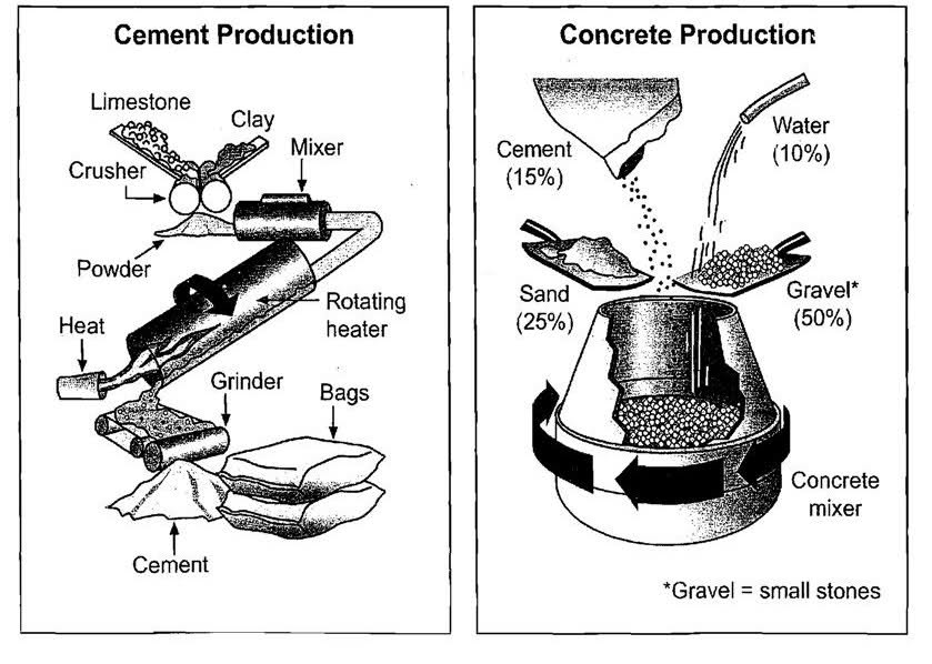
Process – cement and concrete production
Maps
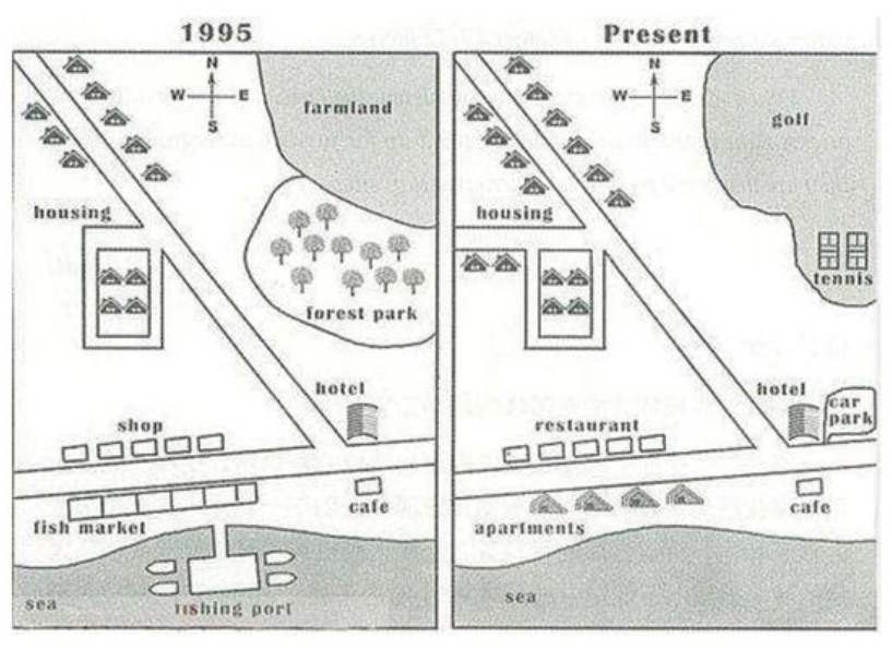
Maps – town layout before and after development
Essential Vocabulary for Task 1
Category
Phrases / Verbs
Example from Model
Introduction
compares, illustrates, depicts, shows
"The bar chart compares the proportion..."
Upward
rose, increased, climbed, surged, peaked
"Sweden peaked at 62%"
Downward
decreased, fell, declined, dropped
(useful for other charts)
Stable
stabilised, remained steady, levelled off
"France stabilised at around 28%"
Comparison
by far the largest, lagged behind, overtook
"Sweden was by far the largest user"
Time
over the decade, from ... to ..., by 2015
"Over a decade from 2010 to 2020"
Beginner’s 20-Minute Writing Plan
0–2 min: Read title, units, time period → underline main trends
5–12 min: Details paragraph 1 – group similar data, use comparisons
12–17 min: Details paragraph 2 – remaining data + final figures
17–20 min: Check word count (150+), grammar, spelling, articles (a/the)
Common Beginner Mistakes & How to Fix Them
❌ No overview → Always write a clear overview (paragraph 2)
❌ Listing every number → Select key features and group data
❌ Copying question words → Paraphrase using synonyms
❌ Wrong tense → Past simple for past data (rose, increased)
Practice Exercises – Build Your Skills
Exercise 1: Write a Strong Overview
Task: Look at the consumer goods bar chart above. Write only a 2-sentence overview (no numbers, just main trends & comparisons).
Tip: Start with "Overall, ..." and mention highest/lowest or biggest differences.
Exercise 2: Describe Key Changes
Task: Use the hospital admissions line graph. Write one paragraph describing main changes (use words like "rose sharply", "fluctuated", "remained stable").
Exercise 3: Grouping & Comparisons
Task: Look at the underground railways table. Write a short paragraph grouping cities (e.g. longest/shortest, busiest/least busy) and make 2–3 comparisons.
Exercise 4: Mini Report (Process)
Task: Look at the cement & concrete process diagram. Write a short report (introduction + overview + 1 detail paragraph). Time yourself – 10 minutes!
Quick Interactive Quiz – Test Your Task 1 Knowledge
IELTS vs TOEFL: Full Comparison 2026 – Which English Test Is Easier? IELTS vs TOEFL: Full Comparison – Which English Test Is Easier in 2026? Choosing between IELTS and TOEFL is one of the biggest decisions for students planning to study, work, or immigrate abroad. Both exams measure English language proficiency, but they differ significantly in format, scoring, speaking style, and overall test experience. This comprehensive guide compares every important aspect of IELTS and TOEFL so you can confidently choose the exam that best matches your goals. Table of Contents What is IELTS? What is TOEFL? Main Differences Which Test is Easier? Reading Comparison Listening Comparison Speaking Comparison Writing Comparison Scoring System Acceptance Worldwide Fees Comparison FAQ Featured Image Suggested Alt Text: IELTS vs TOEFL comparison for study abroad students. Watch Before Reading What is IELTS? The Internati...
How to Beat IELTS Test Anxiety and Boost Your Score: Top 10 Psychological Strategies ANXIETY SHIELD BAND 9 MAXIMUM SCORE PSYCHOLOGICAL TIMING IELTS BEHAVIORAL MASTERCLASS 10 Ways to Neurologically Disarm Test Panic & Secure Your Band Targets How to Beat IELTS Test Anxiety and Boost Your Score: Top 10 Psychological Strategies Premium Psychological Inoculation Guide • Band 7+ Mindset Walking into an IELTS...
Minimum IELTS Score for Canada PR & Australia Immigration: The Ultimate Permanent Residency Guide CANADA PR Min Baseline: CLB 7 AUSTRALIA GSM Min Baseline: Competent 8777 GOLD STANDARD The Permanent Residency Language Blueprint Comprehensive Analysis of IELTS Thresholds for Immigration pathways Minimum IELTS Score for Canada PR & Australia Immigration Compreh...
Mastering IELTS Reading Comprehension: The Ultimate Band 8+ Guide Welcome to the definitive training hub. If you are starting your journey, make sure to visit our Home Resource Center to map out your overall prep tracker. How to Improve Reading Comprehension for the IELTS: The Band 8+ Blueprint Let's be completely honest: the IELTS Reading sub-test is not actually a reading test. If you sit down in the exam room intending to read all three long academic texts word-for-word, contemplate their meaning, and then answer the questions, you are virtually guaranteed to run out of time. The clock is your primary adversary. Instead, the IELTS Reading component is a highly sophisticated, high-speed search-and-match puzzle . It evaluates your ability to rapidly process massive amounts of complex information, filter out background noise, and pinpoint explicit data points and underlying arguments using an intim...
Mastering IELTS Reading Sentence Completion: The Ultimate Band 9 Strategy Guide Mastering IELTS Reading Sentence Completion: The Ultimate Band 9 Strategy Guide Premium Instructional Resource • Advanced Level Sentence completion questions appear frequently across both Academic and General Training modules of the IELTS Reading test. While they look straightforward—just fill in the blank with words directly extracted from the text—they frequently trip students up. Misreading word counts, falling for clever paraphrasing trap doors, or choosing the wrong grammatical word form can rapidly drop your band score. If you are looking to master the entire reading module, make sure to visit our comprehensive IELTS Reading Hub to build a solid foundational strategy. In this guide, we will break down exactly how to conquer sentence completion questions step-by-step with zero margin for error. 1. What is Reading Sentence Compl...
The Ultimate 4-Paragraph Essay Masterclass | Elite Writing Framework Perfecting the 4-Paragraph Essay Structure: The Exact Structure Needed for Clear Progression Elite Academic Blueprint: Achieve compositional excellence with a high-impact introduction, razor-sharp thematic blocks, and a resonant final resolution engineered for flawless logical progression. Flawless execution: A streamlined structure maximizes analytical clarity and structural authority. The 4-paragraph essay is a masterclass in structural economy. It strips away rhetorical noise to present arguments with exceptional clarity and driving momentum. It is the framework of choice for competitive timed conditions, high-stakes university entry requirements, and focused academic responses. This master guide breaks down the precise structural engineering of the 4-paragraph ...
"Smiling through a friendly conversation—learn to sound natural with softening phrases! #Communication Skills #Language Tips" Polite English: How to Sound More Natural and Friendly By Pores Verma Smart English | August 20, 2025 Politeness is the secret sauce of effective communication in English. It’s not just about following grammar rules or expanding your vocabulary—it’s about making people feel respected, valued, and at ease . Whether you’re chatting with a colleague, emailing a client, or asking a stranger for help, using polite English can transform your interactions , making them warmer and more approachable . One of the best ways to achieve this is by mastering softening phrases like “Could you…?” or “Would you mind…?” and understanding how tone impacts formality and friendliness . In this post, we’ll break it all down and share practical tips to help you sound natural, polite, and confident in any situation. Why Polite English Matters In English-speaki...
Smart English – September Lessons Week 1 – Day 2: Essential Grammar for Exams (Topic: The Present Perfect Tense) Welcome back to Day 2 of our September lessons! Today’s focus is on the Present Perfect Tense , a common topic in competitive exams like IELTS, TOEFL, GRE, and essential for daily spoken English. Many students confuse this tense with the simple past, so let’s clear it up with easy rules and examples. 📘 What is the Present Perfect Tense? The Present Perfect Tense connects the past with the present . It shows that an action happened at some point in the past but is still important now. Formula: Subject + has/have + past participle (V3) Examples: I have finished my homework. ✅ (The homework is complete now) She has visited London. ✅ (An experience that is still relevant today) They have lived here for five years. ✅ (An action that started in the past and continues to the present) ...
.Welcome to the Smart English Blog, your ultimate destination for mastering the art of language and unleashing the power of your words! Forget boring vocabulary lessons; we’re here to ignite your passion for English, one explosive word at a time. Every day, we’ll dive deep into a new linguistic gem, dissect its essence, and arm you with the confidence to use it like a pro. Today, we’re kicking off this linguistic revolution with a word that’s pure, unadulterated energy: ebullient . Let’s get ready to make some noise! Word of the Day: Ebullient! 💥 Part of Speech: Adjective Definition: Overflowing with cheerful enthusiasm; bubbling with uncontainable energy. Pronunciation: /ɪˈbʌljənt/ (i-BULL-yənt) Example Sentence: His ebullient personality wasn't just happy—it was a force of nature that swept through the room, leaving a trail of smiles in its wake. Have you ever met someone so full of life that their joy seems to physically radiate? Or witnessed a moment so...
Day 68 | Environmental Protection Essay — Full Band 9 Model Answer | IELTS Smart 🎓 IELTS Smart by Shahida Noreen · Daily Band 9 Writing Practice · Band 9 Preparation Hub → IELTS Smart by Shahida Noreen Home Band 9 Hub ✍️ Writing 📐 Grammar 📚 Essay Library Day 68 · IELTS Writing Task 2 Environmental Protection Essay Full Band 9 Model Answer — Complete Structure Breakdown, Advanced Vocabulary & Examiner Commentary Published May 2026 · IELTS Smart · Writing Task 2 Series Target: Band 9.0 Topic: Environment & Society Type: Opinion Essay IELTS Writing Task 2 · Day 68 · Environmental Protection · Band 9 Model Essay Welcome to Day 68 of the IELTS Smart 100-Day Writing Series. Environmental protection is one of the most frequently tested IELTS Writing Task 2 topics — appearing in...







Comments